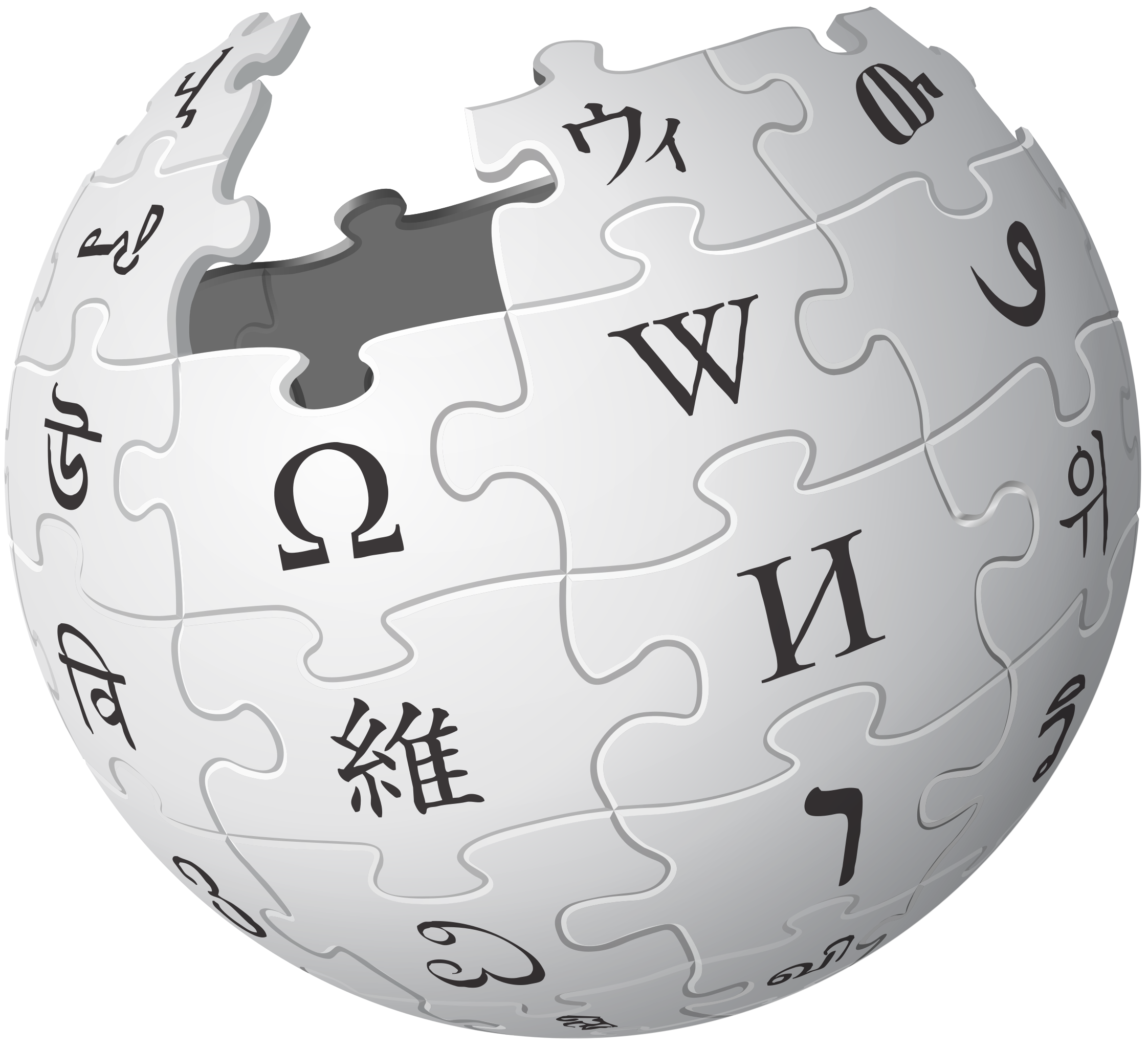
The Wikipedia logo is among the most recognizable symbols of the internet age, yet its meaning is often reduced to a passing glance: a gray globe made of puzzle pieces, letters etched across its surface, unfinished at the top. For a project consulted billions of times each month, that visual shorthand carries conceptual weight. Understanding the logo requires first understanding what is Wikipedia itself—not only as a free encyclopedia, but as a social and technical system built around incompleteness, collaboration, and linguistic plurality.
Get a Backlink from Wikipedia

We secure neutral, policy-aligned Wikipedia citations for reliable inclusion of your organization within the website. Our work focuses on editorial quality, transparent disclosure, and long-term retention rather than promotional insertions.
No Instagram? Contact us here
This article examines the Wikipedia logo as a designed artifact. It traces its origins, decodes its symbols, and situates its visual language within the broader mission of an online encyclopedia that rejects finality. The analysis draws on primary statements from Wikipedia’s creators, documented design decisions, and institutional explanations from the Wikimedia Foundation.
A Logo Born From Function, Not Branding
Wikipedia did not begin with a polished visual identity. In its early years after launch in 2001, the project used temporary and user-generated logos. This was consistent with wiki basics: rapid iteration, community input, and minimal hierarchy.
The current logo—the “puzzle globe”—was formally adopted in 2003 after a community-driven design process. Contributors proposed, debated, and revised multiple concepts before settling on a globe composed of jigsaw pieces. The design was refined again in 2010 to improve typographic accuracy and visual consistency across languages.
Unlike corporate logos designed primarily for differentiation or marketing, the Wikipedia logo emerged from internal consensus. That origin story already mirrors Wikipedia explained as a project where authority flows from participation rather than decree.
The Puzzle Globe: Knowledge as an Unfinished System
At the center of the logo sits a globe formed by interlocking puzzle pieces. Several pieces at the top are missing. This absence is not accidental.
According to the Wikimedia Foundation, the globe represents “the sum of all human knowledge,” while the missing pieces symbolize that the project remains incomplete. Wikipedia definition does not promise comprehensiveness at any fixed moment. It promises continuous expansion.
In a 2010 blog post announcing the refined logo, the Wikimedia Foundation explained: “The puzzle globe is a visual metaphor for the idea that Wikipedia is a work in progress, that it is never finished.” (Wikimedia Foundation, 2010)
This choice stands in contrast to traditional encyclopedias, which historically presented themselves as finished authorities. The logo encodes a different epistemology: knowledge as provisional and collective.
Letters Without Borders: Linguistic Universality
Each puzzle piece bears a character from a different writing system. Greek, Latin, Cyrillic, Arabic, Devanagari, Han characters, and others appear together on the globe’s surface. None form a complete word on their own.
This typographic diversity reflects a central fact about Wikipedia: it exists in more than 300 languages. No single language dominates the visual identity. English does not receive privileged placement.
The letters chosen for the logo correspond to the first glyphs of the word “Wikipedia” in various scripts. This detail is often overlooked, yet it reinforces the project’s multilingual structure.
Wikipedia overview statistics show that while the English-language edition is the largest, it represents only a fraction of total global use. Millions of readers rely on smaller language editions that document local history, geography, and culture absent from global media.
The logo makes that decentralization visible.
The Color Gray: Neutrality Over Authority
Wikipedia’s logo avoids bright colors. The globe appears in grayscale, with subtle shading rather than strong contrast. This restraint aligns with Wikipedia’s editorial posture.
Neutral Point of View is a foundational policy. Articles aim to summarize reliable sources without endorsing positions. The visual identity mirrors this aspiration. Gray conveys neutrality, seriousness, and a lack of commercial signaling.
The absence of vivid color also distinguishes Wikipedia from advertising-driven platforms. As a free encyclopedia funded primarily through donations, Wikipedia avoids visual cues associated with branding campaigns.
This design choice reinforces trust through understatement.
The Missing Pieces as Invitation
The incomplete top of the globe serves a second function beyond symbolism. It operates as an invitation.
The Wikimedia Foundation has repeatedly emphasized that Wikipedia depends on contributors. Anyone with internet access can edit most articles. The missing pieces suggest space for participation.
In a 2012 statement describing the project’s mission, Wikipedia co-founder Jimmy Wales said: “Imagine a world in which every single human being can freely share in the sum of all knowledge.” (Wikimedia Foundation Mission Statement)
The logo visualizes that ambition. Knowledge is not sealed. It is open to completion by others.
Design Revision and Technical Accuracy
The 2010 update to the logo addressed specific technical issues. Earlier versions included characters that were incorrect, misaligned, or stylistically inconsistent. Community members raised concerns about linguistic accuracy.
The revised logo corrected several glyphs and improved kerning and perspective. This attention to detail mattered symbolically. For a project that values verifiability and precision, the logo itself needed to meet those standards.
The revision process followed the same pattern as article editing: proposal, discussion, consensus, implementation. Even the logo adhered to wiki site governance norms.
Comparison With Traditional Encyclopedia Symbols
Historically, encyclopedias used symbols of authority: books, pillars, laurel wreaths, or seals. These motifs conveyed stability and finality.
Get a Backlink from Wikipedia

We secure neutral, policy-aligned Wikipedia citations for reliable inclusion of your organization within the website. Our work focuses on editorial quality, transparent disclosure, and long-term retention rather than promotional insertions.
Or Contact Us Via Instagram
Wikipedia’s logo rejects those cues. The puzzle globe lacks a base. It floats. It remains open. There is no emblematic frame.
This difference reflects a shift in how knowledge institutions present themselves. Wikipedia introduction materials emphasize process over product. The logo encodes that message visually.
The contrast becomes clearer when placed beside older encyclopedic branding, which often emphasized editorial boards and expert authorship.
Cultural Recognition and Memetic Power
Over time, the Wikipedia logo has acquired cultural recognition beyond its original context. It appears in news coverage, academic presentations, classrooms, and political debates.
The globe has become shorthand for collaboratively produced knowledge. Its silhouette is recognizable even without text.
This memetic quality reinforces Wikipedia’s position as a reference layer of the internet. When search engines surface definitions or knowledge panels, users often encounter Wikipedia-derived information without actively visiting the wiki site. The logo remains the symbolic anchor of that ecosystem.
Criticism and Alternative Readings
Not all interpretations are celebratory. Critics argue that the missing pieces can be read as evidence of systemic gaps: underrepresentation of certain regions, languages, or perspectives.
Wikimedia Foundation surveys confirm disparities. Contributors skew toward the Global North. Fewer than 20 percent of editors identify as women. These imbalances affect coverage.
The logo’s incompleteness can be read as an admission rather than a promise. In that sense, it functions as a self-critique embedded in design.
This ambiguity strengthens the logo’s credibility. It does not claim perfection.
The Logo as Governance Signal
Every design choice communicates values. Wikipedia’s logo signals several governance principles without text:
- Knowledge remains unfinished
- Participation is open
- No single language dominates
- Neutrality matters
- Authority emerges from process
These signals align with wiki basics more clearly than any slogan could.
For new users encountering Wikipedia introduction pages, the logo provides a visual summary of what to expect: a collaborative, evolving reference rather than a polished endpoint.
Practical Implications for Users
Understanding the meaning behind the logo can inform how users interact with Wikipedia.
Actionable insights include:
- Treat articles as living documents
- Expect variation in completeness across topics
- Use discussion pages to understand disputes
- Recognize gaps as opportunities for contribution
The logo is not decorative. It is instructional.
Final Considerations
The Wikipedia logo condenses the project’s philosophy into a single image. The puzzle globe communicates incompleteness, collaboration, and linguistic plurality without explanation. Its restraint mirrors Wikipedia’s editorial norms. Its gaps acknowledge limitation rather than denying it.
Wikipedia explained through its logo appears less abstract. The image reinforces that a free encyclopedia is not defined by closure or authority, but by process and participation. Understanding that symbolism clarifies how Wikipedia operates and why it remains distinct among knowledge institutions.
The logo does not promise certainty. It promises openness. That promise continues to define how the world’s largest online encyclopedia presents itself—and how it expects to be used.

